Atlanta Heat
Island
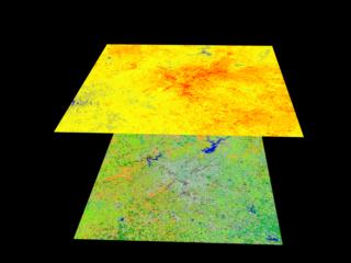
Atlanta Land Use (bottom) and Thermal Image (top)
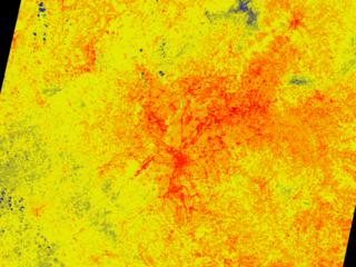
Thermal Image of Atlanta
These scenes show land classification and temperature map of Atlanta,
Georgia derived from the Landsat Thematic Mapper instrument. The land
classification image is derived from the TM's six reflective radiation
spectral channels. The temperature map is computed from the TM thermal
infrared spectral channel. Land use types are classified in ten
categories, with dark grey being urban areas, light grey for suburban
areas, shades of green showing various evergreen and conifer tree
coverage, grassy areas, golf courses, and agriculture, while orange shows
dedicious trees, and blue shows water. In the thermal band
"floating" over the city, blue represents cooler areas, shades
of yellow express intermediate temperatures, and red shows hotter areas.
Researchers used data from Landsat like this shown above to measure the
effect the city has on its environment. The strong correlation between
urban and suburban areas and enhanced temperatures is easily seen. In the
case of Atlanta, the city regularly exceeds the temperature of the
surrounding environment by as much as ten degrees. This extreme
difference causes a number of effects, including the generation of
thunderstorms and promotion of ground level ozone.
More complete information on the
Atlanta Heat Island is available.
Technical notes:
Rendered: March 1999
Data source: Landsat 5 Thematic Mapper; Data courtesy of C.P. Lo (University of Georgia)
For: Goddard Public Affairs Office
|